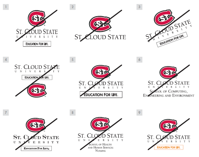
Unacceptable logo usage
It is extremely important for brand success that the logotype, signatures and "St. C" be displayed correctly. This includes always using the correct typefaces, color and the correct relative positioning and size of all elements. Below is a list of things you should not do with the logotype and its elements.
1. Do not distort any portion of the logotype or signature.
2. Do not remove any element of the logotype such as, part of the wordmark.
3. Do not tilt or rotate the logotype to any degree.
4. Do not rearrange any elements of the logotype.
5. Do not alter the size of any of the individual elements of the logotype.
6. Do not alter the size of the signature in relation to the logotype.
7. Do not change the typeface of any part of the logotype, tagline or signature. Do not try to build the logotype on your own.
8. Do not stack multiple signatures. Only one of the following may be addressed at a time: college, school, department, sub-department.
9. Do not make any part of the logotype any color other than the acceptable color options.
