Colors and logo usage rules
Using Color to Tell Our Story
It’s not just red. It’s St. Cloud State University Spirit Red. And it symbolizes passion for education, a bold perspective of the future and a promise to our students and faculty to help them find success. Using these approved colors in all communications will strengthen St. Cloud State’s identity, create impact and help differentiate information.
 |
 |
 |
 |
 |
 |
|
Spirit Red Pantone 200 |
Granite Black CMYK: 0, 0, 0, 100 |
Blizzard White CMYK: 0, 0, 0, 0 |
Silver Gray Pantone 429 Huskies logo only |
Bold Orange Pantone: 165 Secondary color palette |
Glacier Blue CMYK: 24, 0, 0, 48 Secondary color palette |
Use the following guidelines when using logos and logotypes on printed materials and merchandise. These guides will help you determine which logo applications to use on various light, dark or patterned backgrounds.
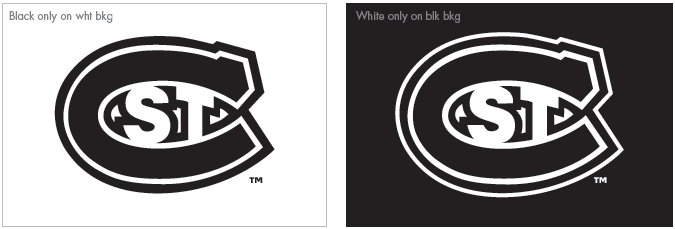
The “St. C” has been updated to always carry a white outline to help define it when placed on a medium/dark background. When used on white, the outline disappears into the background.
Unit and university logotype usage
Light backgrounds: Wordmark and tagline, or unit name, should always be Granite Black on white or light background applications. Remember, when using full color on white, the outline around the "St. C" disappears into the background.

Dark backgrounds: The “St. C” should remain in the three-color treatment; the wordmark and any additional signature should be reversed. The “St. C” logo must include a white border around the perimeter when used on any colored background to clearly define the black edge of the symbol. The white border is built into the design of the “St. C” logo.

Medium backgrounds: Typically, use the same color treatment as for dark backgrounds. If legibility suffers, consider other options and consult University Communications.
Pattern/photo backgrounds: Pattern must be simple enough for the logotype to remain completely legible. Be sure there is enough contrast between the color treatment of the logotype and the photo.
'St. C' primary logo usage
Light backgrounds: Any of the color options shown are acceptable. Remember, when using full color on white, the outline around the "St. C" disappears into the background.
Dark backgrounds: Solid or ghosted white are acceptable. Do not use red or ghosted red. The “St. C” logo must include a white border around the perimeter when used on any colored background to clearly define the black edge of the symbol. The white border is built into the design of the “St. C” logo.
Medium backgrounds: Typically, use the same color treatment as for dark backgrounds. If legibility suffers, consider other options and consult University Communications.
Pattern/photo backgrounds: If placing the “St. C” logo on a photo or patterned background, ensure there is enough contrast to keep the symbol legible. Ghosting white on photo backgrounds is a preferred treatment.
Ghosted “St. C:” The ghosted “St. C” can be used as a graphic or background element. Always use the black only “St. C” version and multiply or screen to achieve the desired effect. Never use the white only version to screen back. Clear space is not required. Do not rotate the “St. C” in any application. The full color “St. C” should never be ghosted or cropped.
Metallic inks: When printing the “St. C” in metallic ink, please use the black only version.
Huskies secondary logo usage
Light backgrounds: Any of the color options shown are acceptable. Remember, when using full color on white, the outline around the Huskies logo disappears into the background.
Dark backgrounds: Solid three-color or one-color white are acceptable. Do not use red or ghosted. The Huskies logo must include the white border around the perimeter when used on any medium to dark background color to clearly define the black edge of the logo.
Medium backgrounds: Typically, use the same color treatment as for dark backgrounds. If legibility suffers, consider other options and consult University Communications.
Pattern/photo backgrounds: If placing the Huskies logo on a photo or patterned background, ensure there is enough contrast to keep the symbol legible.
Ghosted “St. C:” The ghosted Huskies logo can be used as a graphic or background element. Always use the black only Huskies logo version and multiply only to achieve the desired effect. Never use the white only version to screen back. Clear space is not required. Do not rotate the Huskies logo in any application. The full color Huskies should never be ghosted or cropped.
Metallic inks: When printing the Huskies logo in metallic ink, please use the black only version.
